Allen Watson website redesign
I wrote this post a while back. The content can still be relevant but the information I've linked to may not be available.
There’s no such thing as a completed website because any website should be developed continuously. However, it has been good to ‘finish’ and launch two website projects over recent weeks. Here’s the first of those.
Allen Watson asked CVW Web Design to redesign and modernise their website and base the design on other marketing materials (for example, a CD featuring 3D animations of their drilling techniques).
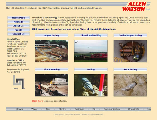
The old website

The old website had a typical colour scheme and design from a few years ago. And the code was also of a similar age with a tables-based layout structure (and quite a few <font> tags, ahem). Images were not of the highest quality. Whilst the old website has the current Allen Watson logo, it was not presented as well as it could be. The website was essentially a product of its time and needed modernising.
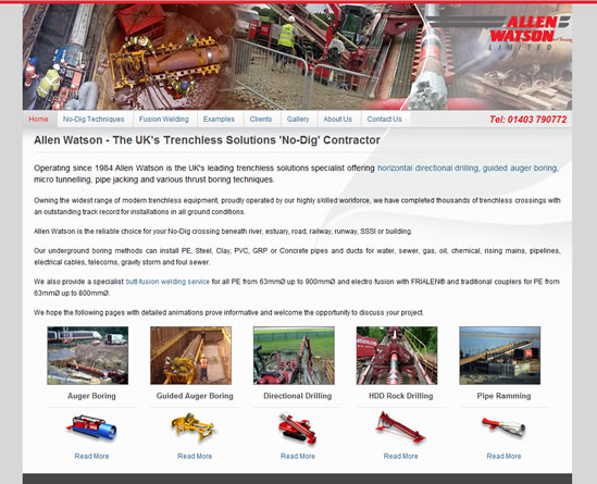
The new website

The new website has a stronger header graphic and better organised content (for example, no-dig drilling methods and techniques including micro tunnelling) together with lightbox-style gallery. The new website has a modern HTML structure and it uses CSS for presentation and jQuery for lightbox, fade image effects, and content hide/show areas (here, Example Industries). The website presents the content in a much more attractive way and new material was added (for example, fusion welding).
We plan to to actively manage and develop the website and we intend that this will make it more effective for the company.
It’s great to see the new website launched!

Comments are OFF for this post.